Notebook-based interactive example#
This is an example page to demonstrate how jupyterlite-sphinx can be used to create buttons (as noted above) that open a JupyterLite deployment based on Sphinx documentation pages where either the .. jupyterlite:: or the .. notebooklite:: directives are used. Here, we use a MyST Markdown notebook, however, traditional notebooks based on the .ipynb file format are also supported.
Matplotlib interactive demo#
Plotting in JupyterLite#
The packages used in this notebook are NumPy and matplotlib, which are available in the emscripten-forge channel.
They are pre-installed into the deployment using the ennvironment.yml file in the docs source directory for the Xeus kernel to load. Once the kernel is started, the packages are available for use right away.
Any extra packages must be pre-installed into the environment before the JupyterLite deployment is built as a part of the Sphinx build process.
import matplotlib.pyplot as plt
import numpy as np

np.random.seed(0)

n = 100

x = list(range(n))
y = np.cumsum(np.random.randn(n)) + 100.

plt.figure(figsize=(10, 6))
plt.plot(x, y)
plt.xlabel('Index')
plt.ylabel('Value')
plt.title('Lines')
plt.grid(True)
plt.show()
# Update the line plot with green color, markers and fill
plt.figure(figsize=(10, 6))
plt.plot(x, y, color='green', marker='o')
plt.fill_between(x, y, min(y), color='green', alpha=0.3)
plt.xlabel('Index')
plt.ylabel('Value')
plt.title('Lines')
plt.grid(True)
plt.show()
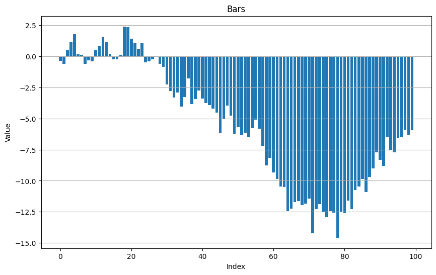
n = 100

x = list(range(n))
y = np.cumsum(np.random.randn(n))

plt.figure(figsize=(10, 6))
plt.bar(x, y)
plt.xlabel('Index')
plt.ylabel('Value')
plt.title('Bars')
plt.grid(True, axis='y')
plt.show()
# Update the bars with new random data
new_y = np.cumsum(np.random.randn(n))
plt.figure(figsize=(10, 6))
plt.bar(x, new_y)
plt.xlabel('Index')
plt.ylabel('Value')
plt.title('Bars')
plt.grid(True, axis='y')
plt.show()
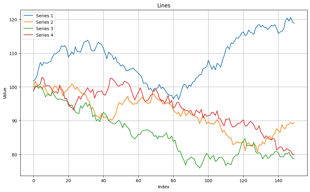
Multiple line plots#
import numpy as np
import matplotlib.pyplot as plt

np.random.seed(0)
y1 = np.cumsum(np.random.randn(150)) + 100.
y2 = np.cumsum(np.random.randn(150)) + 100.
y3 = np.cumsum(np.random.randn(150)) + 100.
y4 = np.cumsum(np.random.randn(150)) + 100.

x = np.arange(len(y1))

plt.figure(figsize=(12, 7))
plt.plot(x, y1, label='Series 1')
plt.plot(x, y2, label='Series 2')
plt.plot(x, y3, label='Series 3')
plt.plot(x, y4, label='Series 4')
plt.xlabel('Index')
plt.ylabel('Value')
plt.title('Lines')
plt.legend()
plt.grid(True)
plt.show()