Notebook-based interactive example#
This is an example page to demonstrate how jupyterlite-sphinx can be used to create buttons (as noted above) that open a JupyterLite deployment based on Sphinx documentation pages where either the .. jupyterlite:: or the .. notebooklite:: directives are used. Here, we use a MyST Markdown notebook, however, traditional notebooks based on the .ipynb file format are also supported.
Matplotlib interactive demo#
Plotting in JupyterLite#
The jupyterlite-pyodide-kernel can install packages in a cell based on import <...> statements, if the importable name of the package is the same as the package name in the Pyodide package index or on PyPI (and the package exists in either of them).
Thus, the below example will work in this deployment, but you may also install any other package(s) on your own using a import piplite; await piplite.install(["mypackage"]) statement, or, better, a %pip install mypackage cell magic.
import matplotlib.pyplot as plt
import numpy as np
np.random.seed(0)
n = 100
x = list(range(n))
y = np.cumsum(np.random.randn(n)) + 100
plt.figure(figsize=(10, 6))
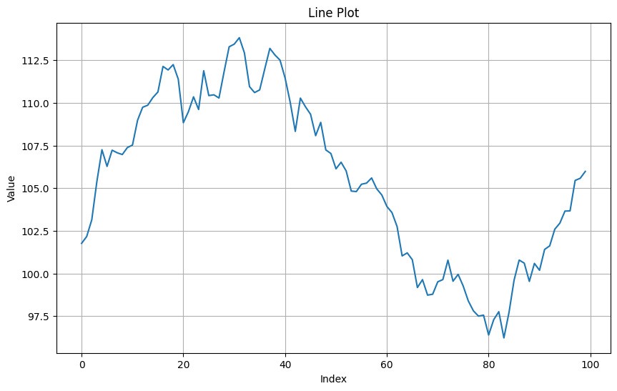
plt.plot(x, y)
plt.xlabel('Index')
plt.ylabel('Value')
plt.title('Line Plot')
plt.grid(True)
plt.show()
plt.figure(figsize=(10, 6))
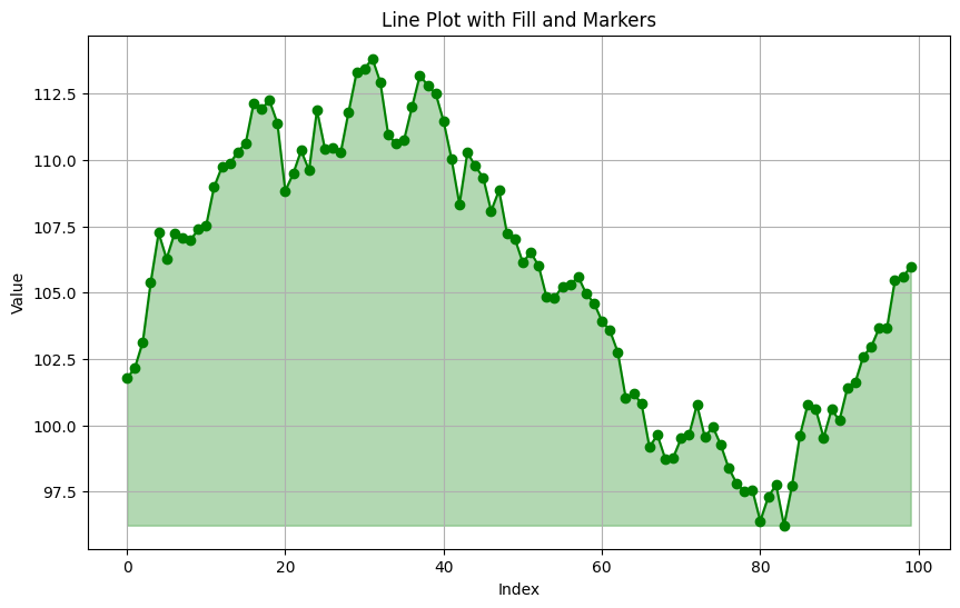
plt.plot(x, y, 'g-', marker='o', fillstyle='full')
plt.fill_between(x, y, min(y), color='green', alpha=0.3)
plt.xlabel('Index')
plt.ylabel('Value')
plt.title('Line Plot with Fill and Markers')
plt.grid(True)
plt.show()
n = 100
x = list(range(n))
y = np.cumsum(np.random.randn(n))
plt.figure(figsize=(10, 6))
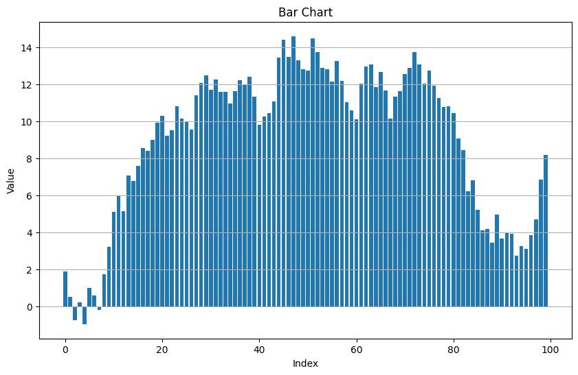
plt.bar(x, y, width=0.8)
plt.xlabel('Index')
plt.ylabel('Value')
plt.title('Bar Chart')
plt.grid(True, axis='y')
plt.show()
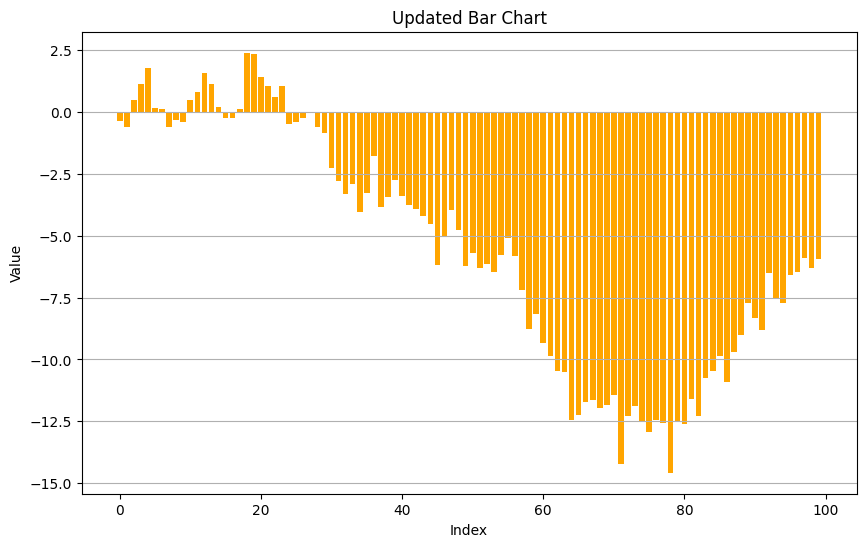
# Update the bar chart with new data
y_new = np.cumsum(np.random.randn(n))

plt.figure(figsize=(10, 6))
plt.bar(x, y_new, width=0.8, color='orange')
plt.xlabel('Index')
plt.ylabel('Value')
plt.title('Updated Bar Chart')
plt.grid(True, axis='y')
plt.show()
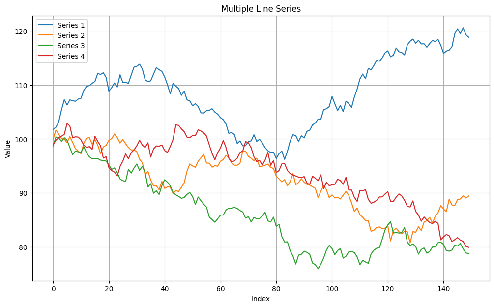
Multiple line plots#
import numpy as np
import matplotlib.pyplot as plt

np.random.seed(0)
y1 = np.cumsum(np.random.randn(150)) + 100.
y2 = np.cumsum(np.random.randn(150)) + 100.
y3 = np.cumsum(np.random.randn(150)) + 100.
y4 = np.cumsum(np.random.randn(150)) + 100.

x = np.arange(len(y1))

plt.figure(figsize=(12, 7))
plt.plot(x, y1, label='Series 1')
plt.plot(x, y2, label='Series 2')
plt.plot(x, y3, label='Series 3')
plt.plot(x, y4, label='Series 4')
plt.xlabel('Index')
plt.ylabel('Value')
plt.title('Multiple Line Series')
plt.legend()
plt.grid(True)
plt.show()